Are you familiar with color psychology?
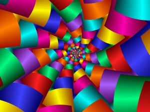
It is a study of how colors affect perception and the behavior of a person who comes into contact with it. The effect can vary based on a person’s gender, age, culture, and preferences. However, there are colors that do relay a general psychological message to the general public. Businesses make use of color psychology to attract, persuade, and engage consumers. Did you know that you can use this to your advantage as a retail business owner as well?
In a basic outline, different colors express different meanings when it comes to items. Here is a general example guide.
Red conveys love, passion, strength, and power. It is also a color that calls to action or urgency. It is effective when it comes to drawing attention. This is why “Sale” signs are usually in red.
Orange reflects energy and fun. It is also a color that gives people the perception of affordability. Orange is dynamic and is popular with a young target market. It also stimulates appetite and is thus compatible with food items.
Yellow is youth, energy, fun, and also intelligence. Due to its correlation to intelligence, it is popular with technical products such as tools and machinery. Yellow is bright and attracts attention. But be careful when you pair it with bright colors or white – the effect might look overpowering and your text would be hard to read.
Green conveys freshness, wellness, wealth, and the environment. Green is a clean and relaxing color and is thus compatible with retail stores. Its fresh hue makes it a good fit for health products and food.
Blue is about truth, loyalty, wisdom, and credibility. Brands that rely on trusts such as pharmaceutical and tech companies tend to use blue. Blue is appealing to the male market. However, it is an appetite downer so you should use it with care if you ever need to put any blue signs around food products.
Purple is a prestigious and luxurious color. It is generally used for expensive items and can make products look classy. Purple is compatible with light colors whether as text or a background, but is also good with dark, neutral shades.
White is fresh, peaceful, and pure. In retail, it speaks of cleanliness. White is good with clothing and hygiene products. It is a flexible color – doing well with almost any other color.
Black is powerful, edgy, formal, and elegant. It is one of the most intense colors and has clear emphasis. It is compatible with any color.
By combining these colors strategically, you can influence your consumers’ perception and potentially increase your sales. Of course, quality will be the main factor that affects your business’ success with customers.
BeePrinting is your go-to for retail printing essentials such as labels, shelf wobblers, swing tags, and table tents.



Leave a comment
You must be logged in to post a comment.